Blog
-
Tanuki style
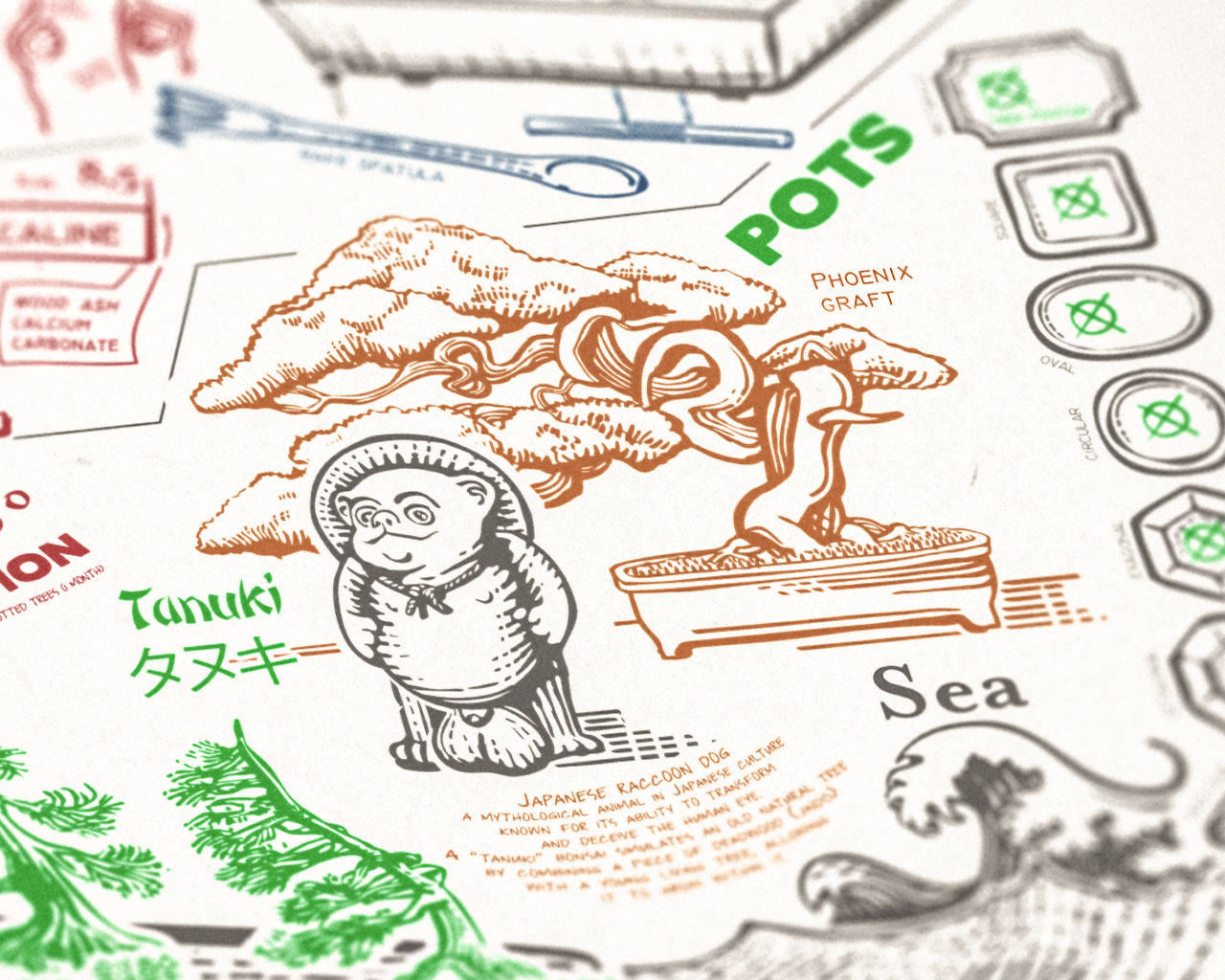
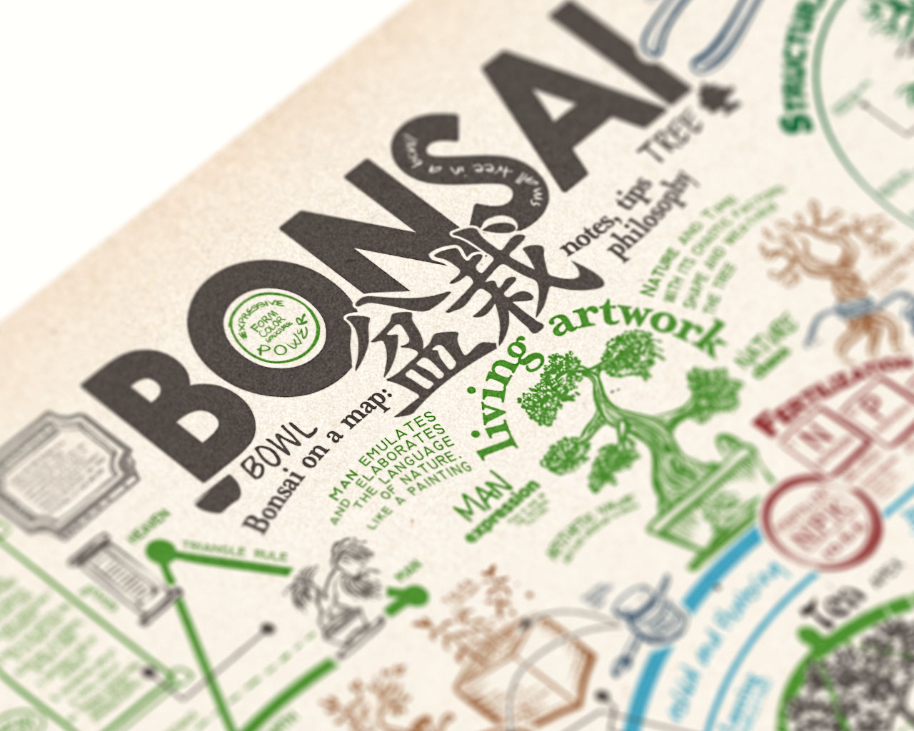
I spent a few more hours working on the Bonsai poster map with some welcoming additions: funny creatures and vibrant colors. I redrew the sea/mountain diorama layout with the different tree styles, added pot styles and small pot icons for each tree style, and included pot shape references in the bottom right corner.
-
Some settings
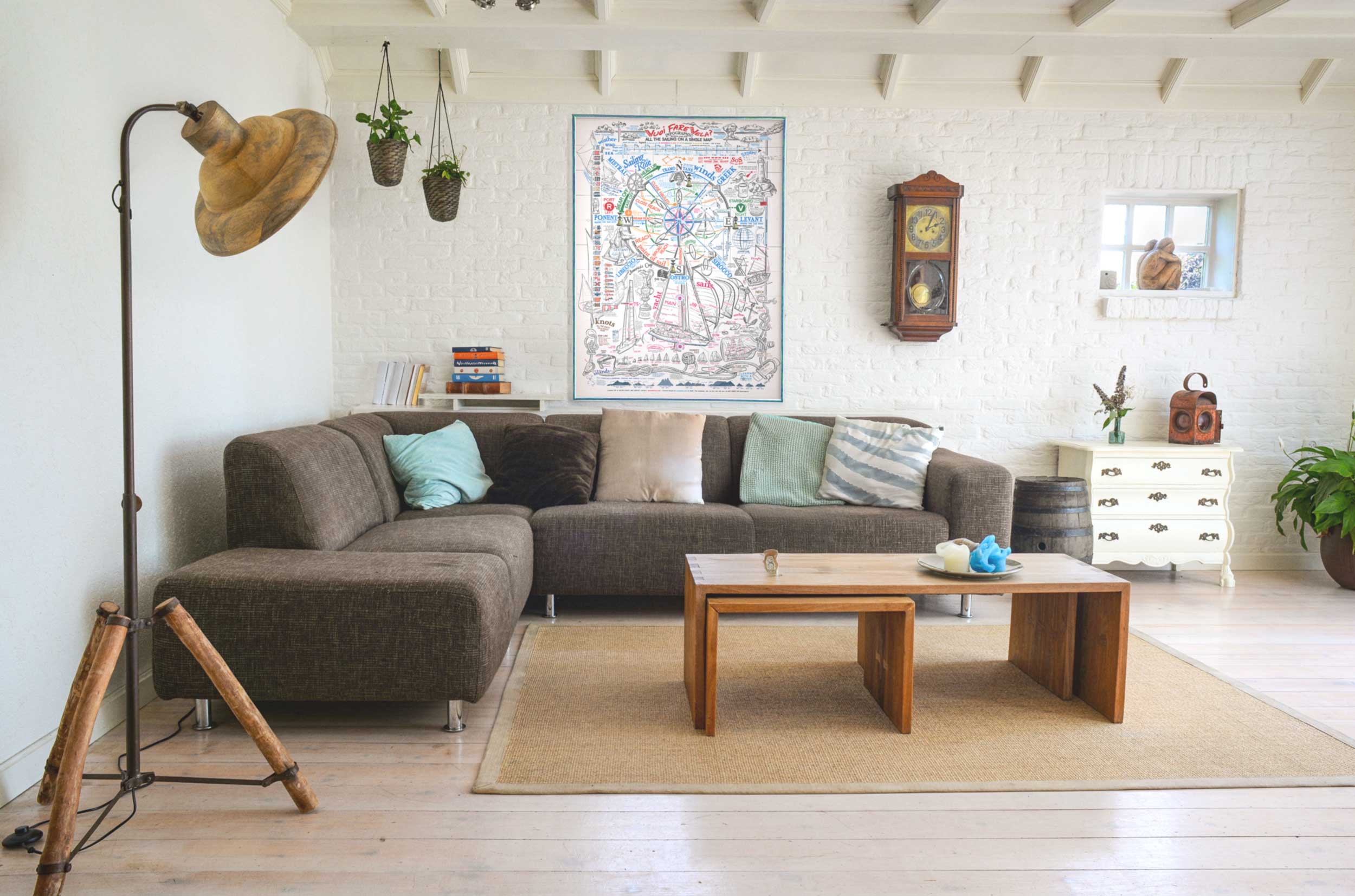
It’s an honor to see our posters in real spaces around the world – dining rooms, pubs, and gardens. Here is a small gallery with some of my recent favourite photos people sent me recently.“It really ties the room together” don’t you think ? (cit. Big Lebowsky)
-
Cardinal marks
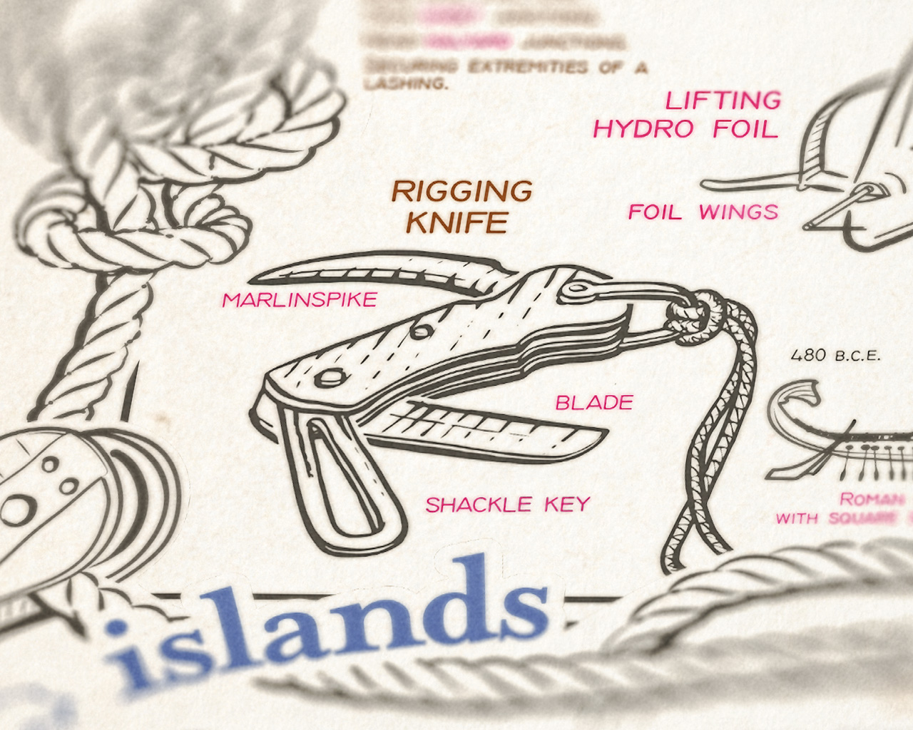
Some weeks ago, I was invited to a sailing school inauguration party: laughter, sailing theory games, and alcohol—because sailors always like to be associated with pirates Walking down the old brick corridor between the small library and the scholars’ classroom, I saw the usual school prints with nautical maps, old sail-race photos in black and…
-
Suzanne with fedora update
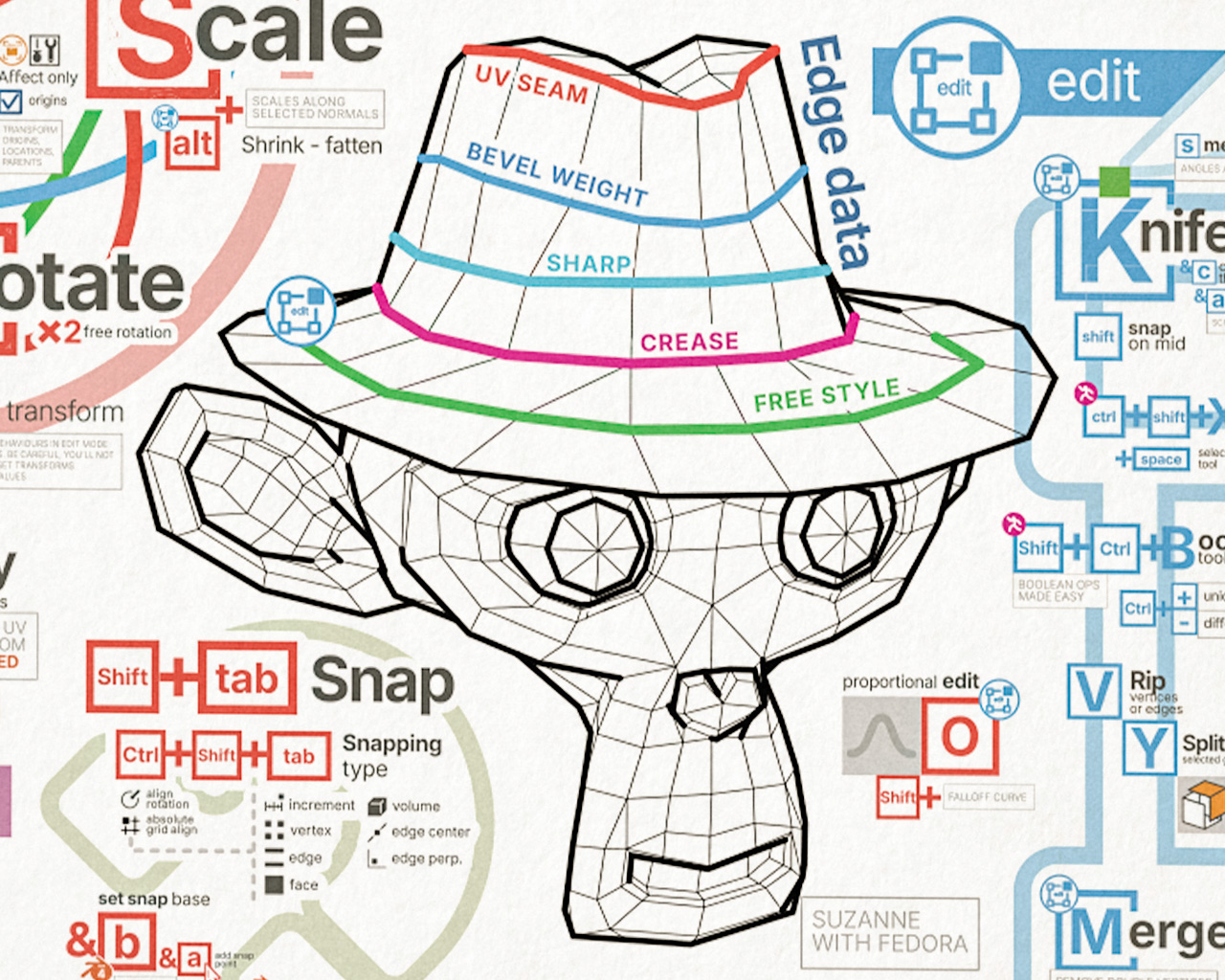
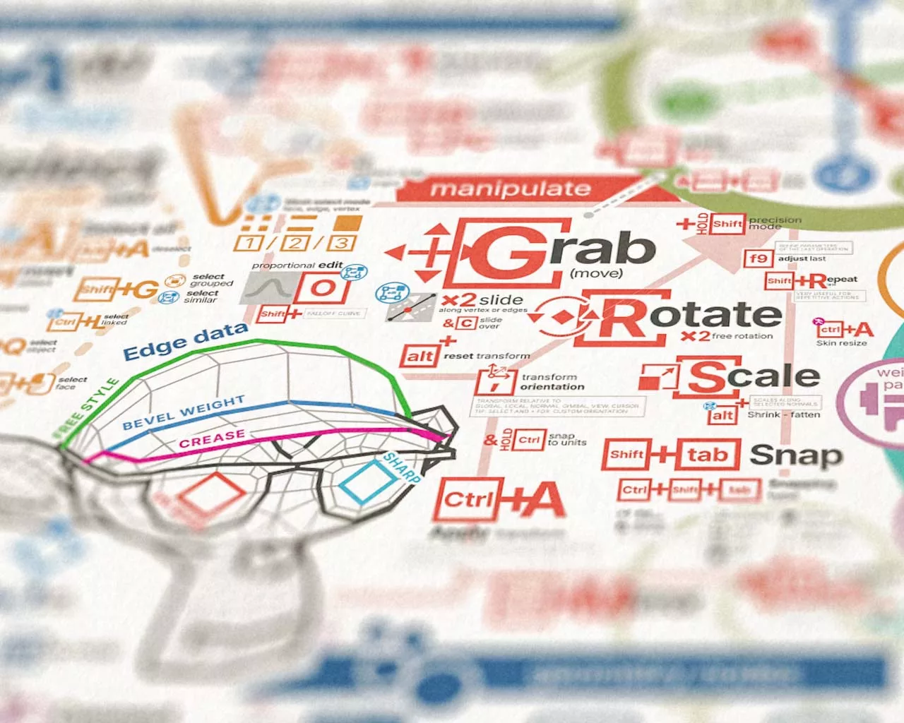
Our favorite monkey head wears a Fedora hat, celebrating the imminent return of a hero in a well-known game title. This is a substantial update to the Blender infographic poster. It includes numerous fixes, improvements, new functions, and shortcut updates that came with Blender version 4.2. The transform and viewport sections have been completely overhauled:…
-
Blender 4 and geometry nodes
New Update for Blender 4: More Density, More Tips, More Shortcuts Blender’s infographic poster has never been so dense and detailed! If you previously hated it, you might have even more reasons, but if you loved it, your appreciation is set to increase even further! I’ve introduced a new section on geometry nodes with basic…
-
Bonsai meaning headline
For quite some time, I’ve been eager to refine the headline to better capture the essence and authenticity of its Japanese roots. My aim was to infuse a more original Japanese aesthetic into the font style, and to incorporate the native pictogram for the word “Bonsai” in the poster’s title. The previous design felt overtly…
-
All the camera work on a single frame
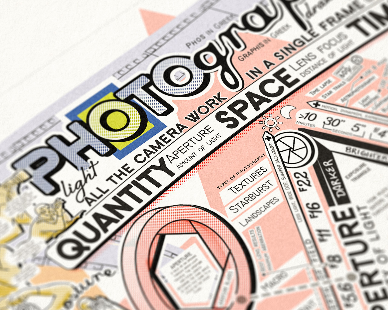
Everything about photography in a single giant poster infographic. It’s the fourth artwork piece for my “Learn with a poster” serie; visual elements are inspired by ’70s newspapers, blueprints and camera manuals, with typographical screen patterns. A long work of design, driven by a personal and professional passion for photography. As a technical discipline and…
-
Blender poster update
Some shortcuts fixes and updates for Blender 3.3! Color input picker tip added
-
Sailing poster July 2022 edition
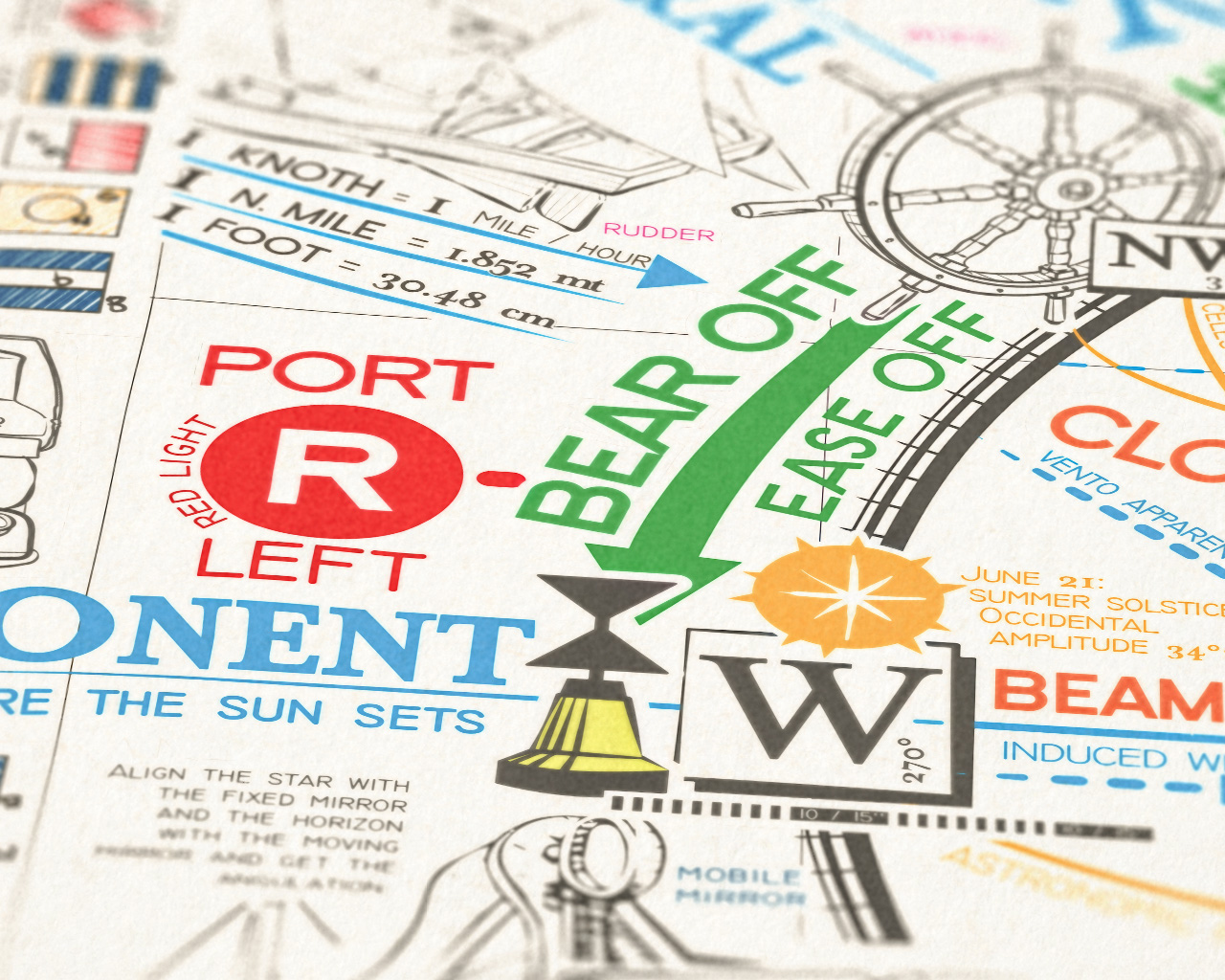
Glad to present a new small but not so small update on the “All the Sailing on a Single Map” poster infographic. Every small update need recomposite lots of elements of the illustration, and it takes time. Weather section redesigned: wind strength now also shows visually its scale with the windsock rings. Each ring indicates…
-
Blender poster june update
Reset trasformation connection revidited. Mesh loopcut sub-options added. Mesh context menù and mesh select menù moved to its section. Added skin resize (plugin) shortcut. Tweked and improved some icons and infographics.
